Newswire provides press release writing and distribution services to organizations seeking visibility across media outlets. While the service delivered a strong ROI, customers often struggled to understand the value of those results because the distribution report was not discoverable and it ws difficult to interpret.
We led the redesign of the press release distribution report, transforming it from a static, text-heavy page into an interactive, insight-driven experience. The new design helped customers clearly understand the impact of their campaigns while reinforcing the value of Newswire’s service, and ultimately, improving customer retention and driving new opportunities for growth.
To provide some context, imagine a marketing manager at an agency who sends a press release through Newswire and needs to be able to answer to their client/boss/team how the release performed. Did it get picked up? Have they gotten any earned media? How much and from whom? What's the trend?
The original distribution report wasn't really give them those answers with good clarity. The experience consisted of a long scrolling page filled with dense text and charts that lacked context or explanation. Key metrics weren’t clearly defined, and some terms carried different meanings depending on the customer—leading to confusion and, in some cases, mistrust of the data.
Without a clear way to interpret and present results, customers struggled to demonstrate the value of their PR effort, making it harder for Newswire to reinforce the value of its service and retain customers.
Customer interviews and internal stakeholder discussions revealed several key issues with the existing report which caused it to fail in its main mission: tellling a clear story about the impact of the service.
Working with product leaders, the business team, and engineers, I defined the core customer, the key questions the report needed to answer, and the data we could reliably present—while introducing new AI-driven insights from emerging services.User interviews revealed that customers didn’t just want more data—they needed clear, trustworthy insights that could demonstrate performance and be easily shared with stakeholders.
Three core design principles that resulted from my research, that I would apply to every aspect of the feature :
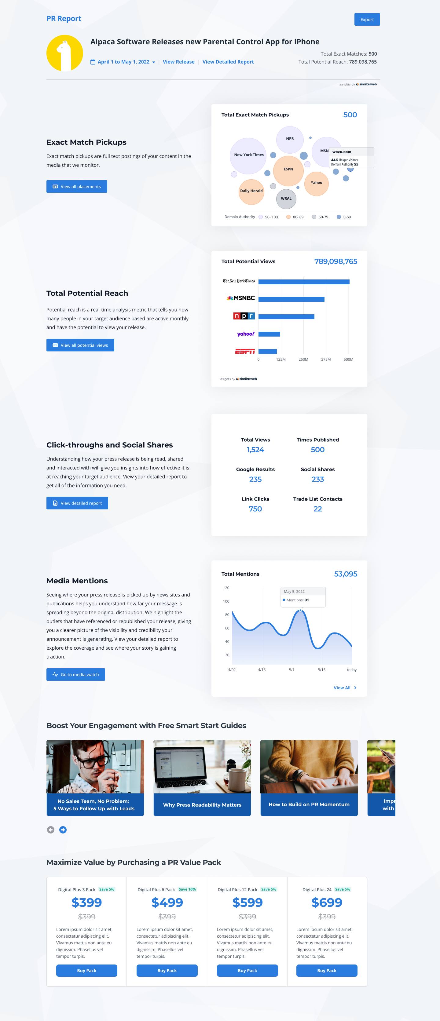
The redesigned distribution report transformed a long, static page into a structured, interactive experience that clearly communicated the impact of each press release. I organized the report around the key questions customers needed answered, highlighting the metrics that demonstrated reach, engagement, and media pickup. Clear data visualizations and concise definitions helped users quickly understand the results, while interactive sections allowed them to explore deeper insights without being overwhelmed. I also introduced new data points powered by AI and emerging services, providing richer context about media coverage and audience impact. The result was a report customers could confidently share with executives and clients to demonstrate the value of their PR efforts.
A mostly static page filled with incomplete and inconsistent information. Broken links, missing data, and unclear metrics made it difficult for customers to trust the results or understand the true impact of their press release.

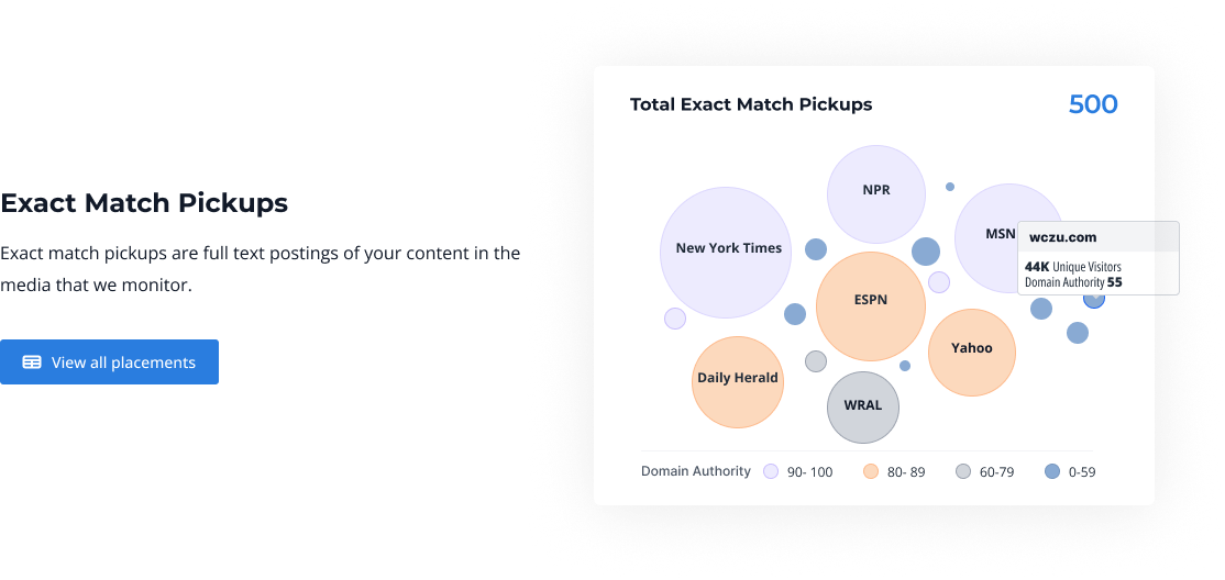
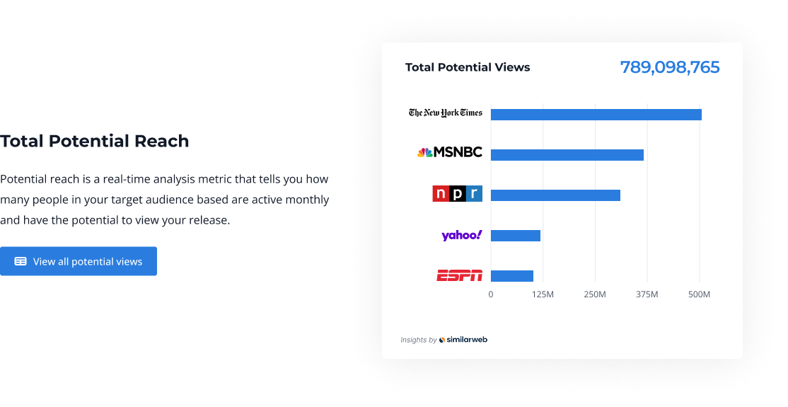
Dynamic charts allow users to explore their results in greater detail. With filters for device type, location, and country, customers can quickly uncover meaningful insights and share a clear picture of their press release performance.
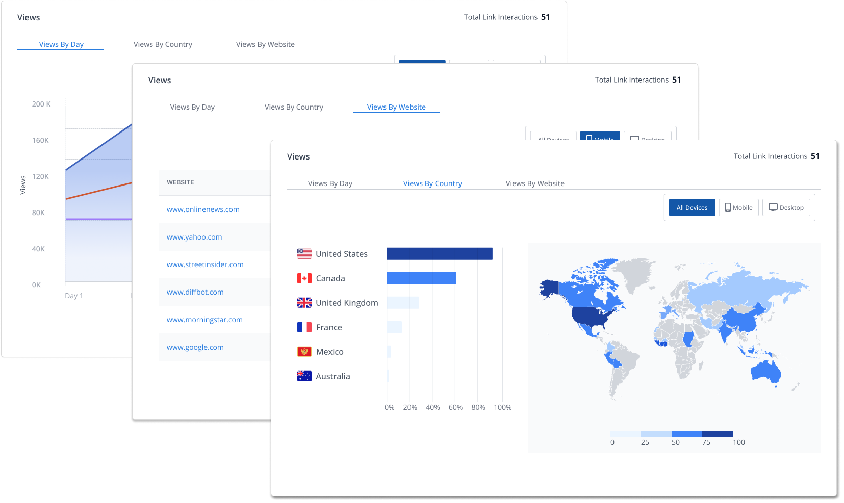
At-a-glance customers can see the info they care most about, like where their press release is getting the most traction.
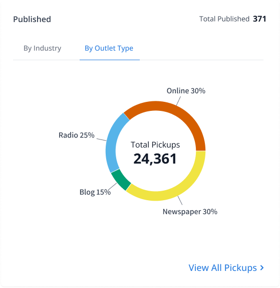
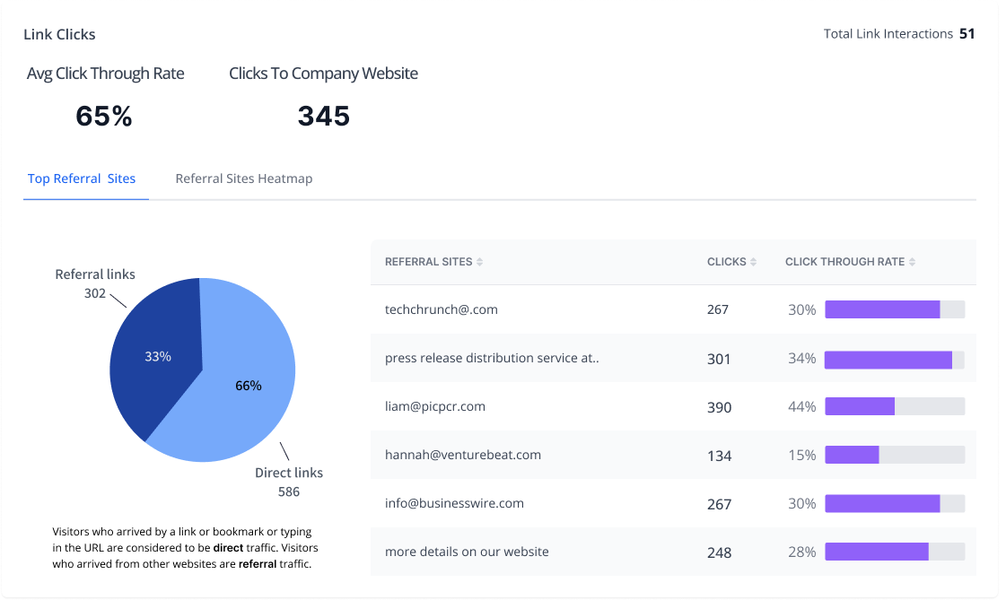
Summary cards surface the most important metrics and explain what they mean—so customers can understand the results at a glance without digging through the report
Persistent access and simplified steps eliminate confusion, making support feel secure, trustworthy, immediate, and repeatable.

Persistent access and simplified steps eliminate confusion, making support feel secure, trustworthy, immediate, and repeatable.

The redesigned report made it significantly easier for customers to understand and communicate the value of their press release distributions. As a result: customer churn decreased by 9%, customer engagement with the report increased significantly, customers began using the report as evidence of campaign success for internal stakeholders, and the report became a gateway to additional Newswire services and upgrades.
Based on the success of the redesign, the parent company, Issuer Direct, commissioned a similar redesign of reporting tools across its broader product portfolio.
.svg)
